HOME | DD
 quartervirus-archive — Costume-Parisons

#british #captain #character #french #hunter #james #lasalle #louis #navy #pirate #despatis #sakart #honouramongstthieveshat #development
Published: 2012-08-25 15:54:09 +0000 UTC; Views: 43634; Favourites: 984; Downloads: 0
Redirect to original
Description
WARNING: OLD ART!! The art and comments in this Deviation may no longer represent the artist's current views or interests.
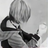
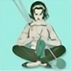
Some costume designs after a feedback session with my professor. These characters are too detailed for the animation and will be simplified later.
On the left: over-extravagant Louis dressed in red for passion and white for that impeccable cleanliness and pride, while James looks more grounded and compact in plainer, duller colors. He is the no-nonsense to offset Louis's flamboyancy. To the right were their "original" costumes: Louis looks more "piratey" and his colours reflect the French flag, and James in traditional attire for admiralty. These colour schemes and costumes looked too similar.
--Sak
All characters and artwork © Shamine Athena King
Related content


Comments: 220

I don't mind people using my art to practice their own, it's how we all learn to improve.
👍: 0 ⏩: 1

Thanks  (Smile)")
👍: 0 ⏩: 0

I like the one with the pink! It's a nice change from his usual outfit!
👍: 0 ⏩: 0

okay..........i'll give you a serious critique............
as you say it yourself there are more differents between louise and james in the left part than in the right part.......
but here is what i think..........
the choice of colors at the left is the right one.......... but the costumes charisma (the way you draw the cloth) is more right on the right side............
if those could be combined i think it would made the impact you seem to be looking for..........
as i see it now and from what i have seen throug storylessons in school.......louise on the left looks more as a young lord than a pirat......as he on the left looks more as the true captain........
james on the left makes me think of a harbor working officer.......not quite the admiral he is on the right side........
soo....this was my thoughts..........hope it was in some way usefull.........
would love to have a reply if you aren't to busy or something like that............
👍: 0 ⏩: 0

Come on James, You can't resist those hips. The. HIPS. Don't. LIE! D8
👍: 0 ⏩: 0

I think I've fallen in love with your style and knowledge of anatomy and character design.
👍: 0 ⏩: 0

is it just me, or does the commodore's second costume loke like one of the Prince outfits in Fable III?
👍: 0 ⏩: 1
I see it too, except the coat is closed in fable >.<
👍: 0 ⏩: 0

i like louis from the right and james frim the right i feel like i you went for both of them on the right they would be way too similar and luios from the left's white hair washes in with his white face make up. Plus, louis looks better as a blonde, ecpically because he is french. P.S love these characters!!!!your artwork is amazing so glad you let us help you chose how we would like to see these characters<3
👍: 0 ⏩: 0

the best would be Louis from the left and the Commodore from the right. Though Louis should have blond hair, not white.
👍: 0 ⏩: 0


I prefer the Commodore's outfit on the left, however: I think that that Louis' original costume accentuates his character better.
👍: 0 ⏩: 0

From a purely asthetic viewpoint, I like the originals more. I find the colour combinations more pleasing to my eye, and I really like the design of the Commodore's uniform. My own personal opinion!
👍: 0 ⏩: 0

Louis is like if the Joker and Prince Poppycock had a baby. I cannot even express all the love I have for this.
👍: 0 ⏩: 0

First of all, I just LOVE the new characters, they're hilarious XD Personally, I think the Commodore is great on the right side but the colours of Louis' clothes are kinda too serious on the right and just a little too exaggerated on the left... In general, I prefer Louis on the left side, but maybe with darker boots? Just a thought
 (Wink)")
👍: 0 ⏩: 0

I kind of like Louis' blond hair opposed to the white, gives more depth and colour to him, considering his necktie is white, his face is white and his boots are white. Other than that Louis' design is wonderful. I like the design you have for James now opposed to the older one; it's more him.
👍: 0 ⏩: 0

I'm so loving these characters and you've only shown us a tiny bit of them. Oo Is it wrong though that my mind immediately gives Louis, Prince Poppycock's voice?
👍: 0 ⏩: 1
I wasn't aware of Prince Poppycock when I created him. Fancy as he is he's not that flamboyant. I imagine his voice ranged somewhere up in Alphaville's 'Dance With Me', with a hint of a French accent mingled in there.
👍: 0 ⏩: 1
It was the pink costume that had me going all Poppycock originally. That and the hair. Oh, how I love his hair but now that I've taken a listen and I' must say I like your concept voice with him. I can't wait to see more of these two, even if it's just snippets. Louis just seems like the type I'd get a kick out of hanging around with.
👍: 0 ⏩: 0

Hmm I think the left ones are the best. I'm not really sure does blonde really suit Louis, it makes him look... well porn star so to speak 
On the left those feathers's colors now make an excellent balance to whole constume+make up. Flashy, but in a good way. Though I'm not sure of the color of the huge ribbon in his hair, it might "disappear" into his jacket's red color. Red for it is good, but maybe a little darker would be better...
James's costume on the left is way much better than on the right which looks way too flashy and yet way too common-like clothing (meaning it's been seen way too many times during historical movies/stories etc). The left one has it's own idea and looks far better. And the darker blue sort of makes him look ..uhh what's that english word... steady, and yet being ready to burst into action.
👍: 0 ⏩: 1
Thanks for the feedback!
👍: 0 ⏩: 0

oh, sorry. you're looking for feed back. I prefer Louis's outfit on the left, but both of James' outfits are really nice. I can't decide which I like more. lol
👍: 0 ⏩: 0
they're super cool. of course, I prefer the flamboyantness of Louis better. lol
I know you've probably heard it a million times, but the character reminds me of Prince Poppycock.
👍: 0 ⏩: 0

I'm leaning towards the right ensamble myself, but I agree that the ones on the left contrast a lot better. The right gives me more of the impression that they are going to a ball or other extravagent event, while left seems a little more sea worthy.
👍: 0 ⏩: 0

James's outfit on the right is perfect for him, but I don't recommend the colors for Louis's right outfit. It kinda makes the guy looks more like a frilly ballerina dancer instead of the comical guy he's supposed to be. Perhaps darker shades of pink?
👍: 0 ⏩: 0

These characters are simply brilliant. I like how... floofy, I guess, the left design for Louis is. I'm excited to see more of these guys, they're fun.
👍: 0 ⏩: 0

Wow, I keep missing your updates lately, I know nothing of this new project. They look 'Fabulous, Darling!' (Though for a three minute animation by yourself, I would hope you simplify them. Spent 2 months on a one and a half minute ani and they're not very detailed. Though I am shading them in charcoal. And we had a two week hiatus. Clients are annoying!)
I agree with you about the ones on the left, really sets off the contrast in character. May I suggest Louis's hair stay blond like in the first and his feather be the same colour as his boots?
👍: 0 ⏩: 1
"Naturally these characters are too detailed for a three-minute animation all by myself, but I'll simplify it later." Thankfully I draw decently fast, either way, though tweening always takes a painful amount of brainpower.
These are by no means the final designs. He might not even be wearing this same costume or these colors in the final version, but I'm definitely keeping all this feedback in mind.
👍: 0 ⏩: 1
Oh, of course. Design process
And sorry, I was agreeing with your statement, only I was tired and rambling a bit yesterday. From the amount of content you upload I can see you have a good drawing speed. And yes, tweening
")

👍: 0 ⏩: 0

If I had to choose, I really like the design of the original costumes best. I get the impression from Louis' getup that he is quite proud to be French and the placement of the colors is artfully done. However, I will say that he looks more likely to join a fight and get his hands dirty in those colors than in the pristine costume on the left, which may not be what you're looking for.
James appears more policeman-like on the left, so I liked the right side one better. It seems that one does not get to be an admiral without having to pay attention to things like proper uniform attire. Extra 100 pts. for losing the wig though.
It is so hard to choose! I completely understand your concerns about losing James amongst all the other Naval uniforms, and love the stark difference in color and costume between the two versions on the left. How will you ever decide?!
👍: 0 ⏩: 0

It's incredible seeing how much thought went into the creation of both characters
👍: 0 ⏩: 0


somehow I had to think of "Bon Clay" a.k.a. "Mr.2" from One Piece, when I look at Louis. [link] Long legs, Make-up an so on (though Louis is a lot more elegant!) Someone commented, the colors seem faded, and I agree that the outfit on the left seems too decoloured. Mybe you look at Bon Clay for some inspiration in the color-choice.
Else, I really envy your talent! I'd like to be able to make my characters as interesting too..
👍: 0 ⏩: 0

I got to say , I'm a straight french boy, and even though, I find Louis strangely attractive ..O_0
👍: 0 ⏩: 1
Oh ... well! xD Maybe I can get some translations from you sometime.
")
👍: 0 ⏩: 1
Well, no problem with that .
👍: 0 ⏩: 0

Louis on the right looks great! but, he does look more like a girl than usual.
👍: 0 ⏩: 0
I love left. and I must ask.. have you ever heard of Prince Poppycock?
👍: 0 ⏩: 1
I've mentioned him a few times already. Ironically I only found out about him three days ago; Louis was designed completely without knowing about him, and somehow turned out far too similar.
👍: 0 ⏩: 1

I like the left James and right Louis. ^^
But left Louis has a red hat. And red pirateful hats are epic!
👍: 0 ⏩: 0

I actually like the "french" flag thing you have going on there with the captain
Have you tried coloring the other set in those colors?
👍: 0 ⏩: 1

I was gonna suggest something similar.
👍: 0 ⏩: 0

Oh my goodness, so many things to be commented on!!!! This makes me very happy, because these two characters are just so fun and awesome~! I've been dying to see what else was posted while I was at work, working with 16 foot Burmese pythons and such, but that's beside the point.
You've officially made pink a more stomach-able color with Captain Fabulous, and damn does he make it look good! I am VERY conflicted over these outfits as to which looks better on his fabulous-ness. I must say the outfit with the reds and pinks is very flirty, fun, and attention grabbing, and the blue make-up looks stunning with it. It makes Fabulous look more dashing, daring and definitely more alluring with his stare. It's more feminine with the frilly-ness, and the colors emphasize him greatly. Seeing him in the blue outfit though in those original colors makes this VERY hard! I got used to him from the comic with those and honestly I love that design... But the pink and red definitely gets your point across clearly, and has more attitude ! I see Fabulous enjoying his game of chase more with the commodore is this outfit. It's cheeky, playful, and very flattering. ;D That and I think the outrageous colors would be more of a 'what that . . . .' for poor James! xD
Now for Commodore Homophobe... I love his original design (left ) with the more traditional outfit. It defines his character better to me, and has a lot more going for it. The colors and details are greater, and the outfit doesn't seem to blend together and become lost in just one suited color. I also think the loss of the wig makes him more rough, and gives him more masculine qualities that offset and complete Fabulous. This makes them more of opposites, and boy do they attract that way for good chemistry and interaction. This outfit seems to go great with the other as well, and just gives this handsome man more charm and gives more interest rather than just the solid colors on the other. (Then again I just think I'm obsessing over him... Lol.)
Anyway I think the left for Louis and the right for James would be an interesting combination. I can't wait to see what you pick though, and I definitely can't wait to se more progress!
👍: 0 ⏩: 1
Ohhh wow ... thank you so much for that mouthful of a comment! I wish I could write back something equally as ... long ... and thoughtful ... but I think you did all the thinking for me!
James is a toughie, but maybe throwing him in with the rest of his society - the redcoat soldiers milling about the British port - will help decide the final outfit. He has to stand out somehow; my main concern with the outfit on the far left was that it's very similar to how the rest of the naval military would have dressed, which makes him blend into the background whereas Louis steals the show with his attire alone.
👍: 0 ⏩: 0

My god I just LOVE how you design characters! I love watching your drawings slowly build the character. So awesome! I can't pick between these two honestly myself. They both look really neat!
👍: 0 ⏩: 0

I ADORE the Commodore on the right (that is by far my FAVORITE style of naval uniform of all time.) but I would probably lean towards the designs on the left. They have much more visual contrast between the two characters, with Louis in the predominantly bright warm tones and Hunter in subdued cools (which kinda reflects how they express themselves as I see it: Louis more passionate, James more taciturn.) My only suggestion with them is that perhaps James' cravat could be a bit more under control. He seems the type who would want everything to be "regulation".
...unless of course, you have a hilarious side thing that he cannot tie his cravat to save his LIFE and Louis tries to fix it any chance he can get. ;D Mmmmmm, we can have such fun with cravats.
👍: 0 ⏩: 1
| Next =>